Tag Archives: Design

Kitchen Makeover 1.4 – Island Molding

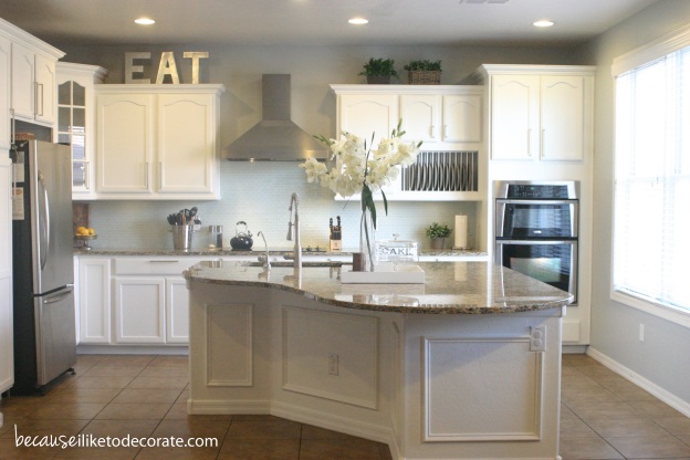
For the final post in my Kitchen Makeover series, I’m sharing with you the kitchen island molding project. This is another example of how something so simple and inexpensive can create a big difference in your space!

Kitchen Makeover  I  becauseiliketodecorate.com

Kitchen Makeover  I  becauseiliketodecorate.com

The molding creates a custom look at a low price by creating faux wainscoting on the island base. Painting this area the same white color as the cabinets makes the entire kitchen look that much bigger!

Kitchen Makeover  I  becauseiliketodecorate.com

This is not expensive wainscot paneling! I purchased decorative molding from the hardware store for only $.90 per linear foot. You can use a miter saw or a hand box saw to cut your 45 degree angles. Use wood glue to set each piece into place and secure with a nail gun. You could get away with using just a hammer if you have the tool pictured below that will set your nail into the molding without damaging the molding with your hammer.

Nail Setter Set

Next, fill your nail holes with a wood filler and make sure to use caulking on every visible seam! It will look like a cheap job if you don’t fill in all your cracks. Now you’re ready to paint the wall!

This process worked so well, I’ve started to add molding to the rest of the house as well. I have plans for the staircase area as well as the dining room! I love the custom, high-end look this process creates, and I especially love the fact that it can be done at such a low price-point.

Check out all the posts in the Kitchen Makeover series!

kitchenseries1 kitchenseries2 kitchenseries5 kitchenseries3

Lots of love,
Mary

Trend watch: reverse stenciling

I’m always hunting for ideas and inspiration. And since I have a garage full of furniture to reinvent, I went hunting today! Reverse stenciling is trending, and I really do love the look of bare wood peeking through a painted piece. If you look through my home, you’d probably be surprised to know that most of my furniture is pure, unpainted wood. I think wood naturally warms up a space, especially when using a cool color scheme. When painting or updating my furniture, I love to keep a little of the old, while at the same time breathe new life into it. Take a look at these reverse stenciling techniques that inspire me!

Lots of love,
Mary

Follow my blog with Bloglovin

The art of NYC

My very first trip to New York City was a blast! Central Park is so much bigger than what I thought it would be — it’s kind of like a beautiful forest in the middle of the city! Although the lights and tall buildings are to be expected, it’s still amazing to see it all in person! And mostly, I was taken back by the details. Such beautiful architecture, color, and texture in the strangest of places. Enjoy these photos as I tried to capture the essence of what is New York City — in the details.

Under a bridge in Central Park

Under a bridge in Central Park

New York City subway - Penn Station

New York City subway – Penn Station

Dedication bench in Central Park

Dedication bench in Central Park

Somewhere off 5th Ave - NYC

Somewhere off 5th Ave – NYC

nyc2

Somewhere off Broadway – NYC

Central Park fountain - NYC

Central Park fountain – NYC

Apartment Entrance - NYC

Apartment Entrance – NYC

Subway entrance off 5th Ave. - NYC

Subway entrance off 5th Ave. – NYC

Bryant Park - NYC

Bryant Park – NYC

Somewhere off 5th Ave - NYC

Somewhere off 5th Ave – NYC

Bryant Park - NYC

Bryant Park – NYC

Strawberry Fields in Central Park - NYC

Strawberry Fields in Central Park – NYC

nyc7

5th Ave – NYC

Somewhere off 5th Ave. - NYC

Somewhere off 5th Ave – NYC

Lots of love,
Mary

Caspian Blue

Today was a fun day! Movies. Forts. Snuggles. Baking. Blogging. More Snuggles. And all the in-between. Sometimes a mom’s life is a whirlwind. I couldn’t tell you what all I did today… but it was a lot! I did take a few moments to snap some photos of a project I did for baby Jude’s room – A painted dresser/changing table. This was my very first experiment with High-Gloss paint!

I introduce, Caspian:
Caspian, blue dresser. Vintage HenredonCaspian is a Vintage Henredon Dresser that I picked up for a steal at one of my local thrift spots! The quality of this piece is remarkable and it was in excellent shape, save some deep scratches on the top of the dresser.
Caspian, blue dresser. Vintage HenredonThis piece is one of the few things I’ve painted where the original wood is so beautiful. <Don’t shoot me!> Trust me, I had a very hard time deciding. To paint… or not to paint, That is always the question. Once I decided that it was going into Jude’s room, I had my heart set on a bright teal high-gloss finish! There will be others to show restraint with.
Caspian, blue dresser. Vintage HenredonThe color is “Intense Teal” by Behr. I chose their Hi-Gloss Enamel for a super durable shiny finish. To help it adhere, I began with a coat of Glidden Gripper Grey. Gripper is an amazing primer that will literally stick to anything without flaking…even glass!
Caspian, blue dresser. Vintage HenredonThe choice to paint the hardware was an afterthought but really completes the look. Although this piece has a classical style, the paint has really transformed the look to more of a sleek modern or transitional feel. Perfect for my baby boy!
Corbinbluedresser4Photo bombed by a little cutie in the corner! My baby Gabby likes to be in front of the camera. (I wish you could see the smile on my face because this little one melts my heart to pieces!)

Sidenote: Nope, I’m not ignoring the fact that this dresser is standing in front of an AMAZING wood wall that I haven’t told you about yet! Thought I’d give you a little sneak peek. Truth is, it isn’t finished yet. I’m a little stumped on how to finish the wood. So maybe you guys can help a girl out!

Should I…
A. Keep the natural unfinished wood look?
B. Use Teak oil for a natural slightly darker finish?
C. Finish with a honey toned stain (Which would coordinate with the crib)?

Lots of love,
Mary

Top 5 most common design mistakes

I get these types of questions all the time! The plan was to post my top 10, but 5 proved to be packed with lots of information that’s sure to get your wheels spinning! So let’s dive right in, shall we?
top5designmistakes

#1. Mounting draperies too low. I’ll start out by saying that “it’s not your fault.” This is a design industry problem. Most stores only stock a standard 84″ drapery length. This is slowly changing, but still a big issue! Take a look at the below sketch. The #1 tip I tell people is to mount your drapes from floor to ceiling! This one tip will make such a huge difference in your home and will make your space look 10 times larger! Most high-end companies stock these lengths, but for a less expensive option IKEA is my go-to. They stock many options up to 120″ in length, and for a low price.

#2. Tchotchkes — too much stuff on your bookshelf or table! A space filled with 10+ small objects can look cluttered and disorganized. If you would like to display small items, try pairing one or two things with a large statement piece. It will better showcase what you’re trying to display. Notice the variation of height in the below photo. This helps to add interest and is pleasing to the eye. Don’t be afraid of LARGE decorative items. They provide for a cleaner, more high-end look!

#3. Small picture on a large wall. Unless you’re going for the ultra-modern art gallery look, stay away from this common mistake. Don’t be afraid of the large mirror or artwork. I usually choose the largest option when faced with an artwork size dilemma. A great way to use your smaller photos is to group them together to create a gallery wall look. Like this example:

#4. Fear of color. You should never be afraid of anything when designing a space! Choose what you love! I’m not saying that you have to use bright colors. I, for one, prefer a neutral, grey-toned pallet with color accents that can easily be switched out — such as pillows or flowers. But if you love the look of a red wall…go for it! It’s your space, and it’s just paint! :)

#5. Poor lighting. Proper lighting can transform a space from drab to fab! To adequately light a space, you need to think about lighting all levels of your room. Most rooms have a center ceiling fixture, which just isn’t enough. Think about adding canned lighting and/or track lighting to accent artwork on a feature wall. In addition, you’ll want to choose lamps or task lights for more specific directional light. A proper combination of all of the above will help you achieve that model-home look as seen in magazines.

Lots of love,
Mary