
I get these types of questions all the time! The plan was to post my top 10, but 5 proved to be packed with lots of information that’s sure to get your wheels spinning! So let’s dive right in, shall we?

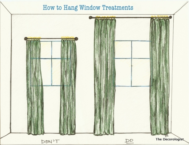
#1. Mounting draperies too low. I’ll start out by saying that “it’s not your fault.” This is a design industry problem. Most stores only stock a standard 84″ drapery length. This is slowly changing, but still a big issue! Take a look at the below sketch. The #1 tip I tell people is to mount your drapes from floor to ceiling! This one tip will make such a huge difference in your home and will make your space look 10 times larger! Most high-end companies stock these lengths, but for a less expensive option IKEA is my go-to. They stock many options up to 120″ in length, and for a low price.
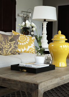
#2. Tchotchkes — too much stuff on your bookshelf or table! A space filled with 10+ small objects can look cluttered and disorganized. If you would like to display small items, try pairing one or two things with a large statement piece. It will better showcase what you’re trying to display. Notice the variation of height in the below photo. This helps to add interest and is pleasing to the eye. Don’t be afraid of LARGE decorative items. They provide for a cleaner, more high-end look!
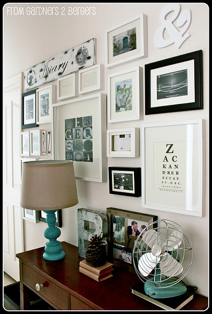
#3. Small picture on a large wall. Unless you’re going for the ultra-modern art gallery look, stay away from this common mistake. Don’t be afraid of the large mirror or artwork. I usually choose the largest option when faced with an artwork size dilemma. A great way to use your smaller photos is to group them together to create a gallery wall look. Like this example:
#4. Fear of color. You should never be afraid of anything when designing a space! Choose what you love! I’m not saying that you have to use bright colors. I, for one, prefer a neutral, grey-toned pallet with color accents that can easily be switched out — such as pillows or flowers. But if you love the look of a red wall…go for it! It’s your space, and it’s just paint! :)

#5. Poor lighting. Proper lighting can transform a space from drab to fab! To adequately light a space, you need to think about lighting all levels of your room. Most rooms have a center ceiling fixture, which just isn’t enough. Think about adding canned lighting and/or track lighting to accent artwork on a feature wall. In addition, you’ll want to choose lamps or task lights for more specific directional light. A proper combination of all of the above will help you achieve that model-home look as seen in magazines.

Lots of love,
Mary


You can add to this – undersized floor rugs!
Agreed!!! :)